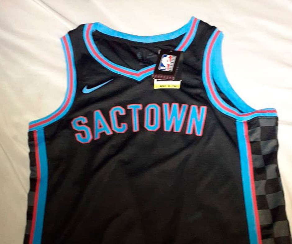
NBA City edition jerseys have been leaking out over the last week or two, and now we get our first glimpse at the Sacramento Kings City Edition jersey for the 2020-2021 season.
???? VAZOU!
Aqui está a primeira imagem do novo uniforme alternativo do SACRAMENTO KINGS.
A textura quadriculada retornou! Ela já apareceu em camisas históricas da franquia.
Ainda não sabemos se a fonte do número vai acompanhar o logo SACTOWN ou se será a tradicional dos Kings. pic.twitter.com/WXiZQC1Cpk
— Camisas da NBA (@camisasdanba) November 2, 2020
This account has leaked pretty much every City jersey that we know about, and hasn’t been wrong yet, so there’s no reason to think this isn’t the actual City jersey.
One of the biggest question marks remaining is the numbering. Will the number font be a throwback? The current number font? Something new? We have no idea.
For the design itself, Nike has brought back the checkerboard side panels from the mid-90s, but in a more subdued way that misses the charm of the originals. And aside from that, there’s nothing that ties these jerseys to the city of Sacramento. The blue and red, although it’s hard to be sure from these photos, appears to be the same color of blue and red that the Kings city jerseys have featured in recent years.
I think these jerseys are an improvement over last year’s red atrocities, but they’re still underwhelming. Kings fans have begged for a return to black alternate jerseys, and Nike blew it.
I’ll reserve final judgement until we see the official photos, but I’m less than impressed. What do you think?


These are atrocious. Considerably worse than the red.
The blue lettering with red outline is literally giving me a headache. Like, am I supposed to be wearing 3D glasses?
These wouldn’t be half bad if they fixed the colors.
…and the team wearing them.
Lol true that
There was a fan mockup with the letters in red neon last week. I honestly though that was the City jersey and I was going to get one.
This….. this is ugly.
More barf
I had not seen this GIF in many moons. Thanks for reminding me it exists!
Well at least we probably won’t have any nationally televised games for more people to laugh at how we look. These suck.
We may not be Miami but you can play hoops here all year round, too!
Take it away, Jan Hammer.
Horrible. Bring back the red it was better than this garbage.
Kings: Hey Heat, can I copy off your homework?
Heat: OK but don’t make it look obvious
Kings:
Extremely underrated comment.
“LEAK” is a good word for this:
https://lh3.googleusercontent.com/proxy/AaqoCb4R7HKvPTP258apOQkA_al1nxKzRyb9GF-IOhki-F-HJecFEA8LaWJwGFU_Ngb18iEhvzwYHE47MwXHsA5XIjk57sAxACb0nOH4zDzbdQ-KnP5wvsOc9WTkcBpSiQ
Worse than the red, not quite as bad as the gold.
They look great! Perfect for a 3D virtual season!!

When does this Nike contract catastrophe end? Season after next, I fully expect orange and navy blue city jerseys.
We can get a new design with a fire sale? These jerseys are on Fire!!

A variation on the Fire season of this one?
Oh dear lord.
“Trees, you say?”

Umm, I’ll pass.
I wonder if this jersey is the reason why Buddy is pissed at the team and won’t take Lose Alton’s calls!
Just another reason to get relevant. Maybe then they’ll spend more than 2 mins coming up with a decent jersey design.
late to the party.
horrible design.
Can it play SF?
Reading the comments, I am shocked at the quantity of people who care about the jerseys.
Improve the on court product.
~~ sigh ~~
We got that puddle of weakness when we could have had this…
https://pbs.twimg.com/media/DuVkwDiUcAABjhs?format=jpg&name=small
Sorry – pic didn’t upload…
Not a big fan of those colors. But can we PLEASE get the bridge on on something like that. It seems so obvious and I can’t figure out why they haven’t done it
I’d guess it’s because people that are designing these have never been to Sacramento, let alone being here long enough to live and experience the culture here.
These are pretty good!
Looking at the official unveiling on twitter, the effects of the pictures make the hideous blue look more white or silver/gray, which improves them dramatically.
Can we still edit with Paint and change the blue?
Yeesh.
The good franchises have consistent color schemes and Kings do not have a clue what their colors should be except different yearly !
Badge Legend