fbpx
Mar. 29, 7:00 PM
DAL @ SAC
Mar. 31, 6:00 PM
UTH @ SAC
Apr. 02, 7:00 PM
LAC @ SAC
Apr. 04, 4:30 PM
SAC @ NYK
Apr. 05, 4:30 PM
SAC @ BOS
Apr. 07, 4:30 PM
SAC @ BKN
Apr. 09, 5:00 PM
SAC @ OKC
Apr. 11, 7:00 PM
NOH @ SAC
Apr. 12, 7:30 PM
PHO @ SAC
Apr. 14, 12:30 PM
POR @ SAC

Sacramento Kings unveil new City Jerseys

These are definitely better than a few other City jerseys we've seen.
By | 48 Comments | Nov 1, 2021

The Sacramento Kings unveiled their new City uniforms Monday morning, with this year’s look being an homage to the Kings past eras. The most notable detail is the black jersey with the 90s-era piping, which Kings fans have been begging the Kings to bring back. The chest wordmark is in a familiar script styling. The shorts have a stripe on one side, with the lion ball logo on the leg. And the waistband has a version of the Rochester Royals logo from the team’s earliest days.

https://twitter.com/SacramentoKings/status/1455190496251289600?s=20

https://twitter.com/SacramentoKings/status/1455194221548228608?s=20

Overall, I think these are really solid alternate jerseys. The waistband logo is a little funky with the very weird way “NBA” was included. And personally I would have preferred the 2002 lettering for “Sactown” instead of the script, but that’s just my personal preferences. Despite those small details, these seem to be some of the best City jerseys the Kings have had since Nike took over.

But that’s just my opinion. What do you think about these new designs? Let us know in the comments.

Patreon Membership
* indicates required


To prevent spam, our system flags comments that include too many hyperlinks. If you would like to share a comment with multiple links, make sure you email [email protected] for it to be approved.
Subscribe
Notify of
48 Comments
Oldest
Newest Most Voted
Inline Feedbacks
View all comments
andy_sims
Vote Up
Comments
Original Member
Patreon Supporter
Vote Up
Comments
Original Member
Patreon Supporter
November 1, 2021 8:53 am

I fully support that the jerseys are, you know, the same color as the team’s actual colors. Red? Sky blue? To hell with that, let the black & purple represent the deep tissue bruise that is Kings fandom.

1951
Patreon Supporter
Comments
Vote Up
Original Member
Patreon Supporter
Comments
Vote Up
Original Member
November 1, 2021 9:00 am

I think that new uniform should fix all of Fox’s problems so far this year.

CarmichaelRave
Original Member
Original Member
November 1, 2021 9:20 am

Simmons is gonna look great in that.

Hippity_Hop_Barbershop
Original Member
Comments
Vote Up
Patreon Supporter
Original Member
Comments
Vote Up
Patreon Supporter
November 1, 2021 9:21 am

Hey! Look! It’s a bird! No it’s a plane! No, its… a city jersey I’d actually buy!

HongKongKingsFan
Comments
Vote Up
Comments
Vote Up
November 1, 2021 9:28 am

not really a fan of this one…

I would prefer the last season one, I like the square pattern at the side of the jersey.

This one is just plain

1951
Patreon Supporter
Comments
Vote Up
Original Member
Patreon Supporter
Comments
Vote Up
Original Member
November 1, 2021 9:28 am

BTW – the center court logo for these is trash!

https://twitter.com/SactownKings916/status/1455186053418135560

So, I came up with a better idea and HeuristicLineup made it so:

https://twitter.com/HeuristicLineup/status/1455208241508478979

BeTheBall
Patreon Supporter
Comments
Vote Up
Original Member
Patreon Supporter
Comments
Vote Up
Original Member
November 1, 2021 5:34 pm
Reply to  1951

Disagree.

1951
Patreon Supporter
Comments
Vote Up
Original Member
Patreon Supporter
Comments
Vote Up
Original Member
November 1, 2021 9:32 am

The center court logo for these unis is … um … not good:

https://twitter.com/SactownKings916/status/1455186053418135560

I came up with a bomb idea and HeuristicLineup executed it perfectly:

https://twitter.com/HeuristicLineup/status/1455208241508478979

BeTheBall
Patreon Supporter
Comments
Vote Up
Original Member
Patreon Supporter
Comments
Vote Up
Original Member
November 1, 2021 5:35 pm
Reply to  1951

Meh, it’s just kinda so-so

1951
Patreon Supporter
Comments
Vote Up
Original Member
Patreon Supporter
Comments
Vote Up
Original Member
November 1, 2021 2:08 pm
Reply to  1951

Seriously, now they all post?

Grr.

BeTheBall
Patreon Supporter
Comments
Vote Up
Original Member
Patreon Supporter
Comments
Vote Up
Original Member
November 1, 2021 5:35 pm
Reply to  1951

I love it!!

WGriffith
Admin
Original Member
Author
Comments
Vote Up
Original Member
Author
Comments
Vote Up
November 1, 2021 9:44 am

No gold?!

These are decent, which puts them squarely at the top of any list of new jerseys we’ve gotten since Nike took over.

Malrock
Comments
Comments
November 1, 2021 9:45 am

These city jerseys do look good but they aren’t much of a departure from the regular jerseys. Say what you will about the red ones but I was able to get my first kings Hat because they went with red that one year.

RobHessing
Patreon Supporter
Comments
Vote Up
Original Member
Author
Patreon Supporter
Comments
Vote Up
Original Member
Author
November 1, 2021 9:55 am
Reply to  Malrock

“Most significant eras.” I prefer the TKH store, which celebrates some of the organization’s most significant errors:comment imagecomment imagecomment imagecomment imagecomment image

Klam
Patreon Supporter
Comments
Vote Up
Original Member
Nostradumbass 18
Nostradumbass 19
Patreon Supporter
Comments
Vote Up
Original Member
Nostradumbass 18
Nostradumbass 19
November 1, 2021 1:25 pm
Reply to  RobHessing

The only Kings apparel I have currently are from The Kings Herald.

andy_sims
Vote Up
Comments
Original Member
Patreon Supporter
Vote Up
Comments
Original Member
Patreon Supporter
November 1, 2021 4:20 pm
Reply to  RobHessing

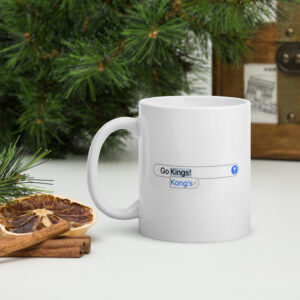
That mug is genius. Perhaps an alt version with Kongs?

BestHyperboleEver
Patreon Supporter
Comments
Vote Up
Original Member
Patreon Supporter
Comments
Vote Up
Original Member
November 1, 2021 9:58 am

comment image

Kosta
Patreon Supporter
Comments
Vote Up
Original Member
Patreon Supporter
Comments
Vote Up
Original Member
November 1, 2021 10:04 am

Not liking these so much.

The font is ok, if the other parts relate to it. But it comes across to me as cutting/pasting the great Golden Era uniforms parts with that cursive font….and with the lion logo.

All those elements are nice on their own, but cutting/pasting them together looks a bit off to me.

I understand their intent was to use a bit from the different eras, but they could’ve done a more interesting job mixing them together.

I like the colors. 🙂

Last edited 2 years ago by Kosta
catterj
Patreon Supporter
Original Member
Comments
Vote Up
Patreon Supporter
Original Member
Comments
Vote Up
November 1, 2021 10:25 am

Maybe I’m the only one butcomment image

BabalooMagoo
Original Member
Comments
Vote Up
Original Member
Comments
Vote Up
November 1, 2021 10:37 am
Reply to  catterj

You’re not.

AnybodyButBagley
Comments
Vote Up
Comments
Vote Up
November 1, 2021 11:12 pm
Reply to  catterj

Me too.

Kingsguru21
Comments
Vote Up
Original Member
Patreon Supporter
Comments
Vote Up
Original Member
Patreon Supporter
November 2, 2021 5:01 am
Reply to  catterj

This is me too, really. I don’t care either way anymore. Unless it’s the gold puke monstrosity’s. Those were hideous even on uniform standard levels.

Last edited 2 years ago by Kingsguru21
BabalooMagoo
Original Member
Comments
Vote Up
Original Member
Comments
Vote Up
November 1, 2021 10:38 am

Hey, maybe it’ll make them play better.

RikSmits
Patreon Supporter
Comments
Vote Up
Original Member
Patreon Supporter
Comments
Vote Up
Original Member
November 1, 2021 11:02 am
Reply to  BabalooMagoo

Dress for success!

comment image

Klam
Patreon Supporter
Comments
Vote Up
Original Member
Nostradumbass 18
Nostradumbass 19
Patreon Supporter
Comments
Vote Up
Original Member
Nostradumbass 18
Nostradumbass 19
November 1, 2021 11:47 am
Reply to  RikSmits

comment image

1951
Patreon Supporter
Comments
Vote Up
Original Member
Patreon Supporter
Comments
Vote Up
Original Member
November 1, 2021 11:11 am

“Waiting for approval” messages are out in full force here.
comment image

Last edited 2 years ago by 1951
Kosta
Patreon Supporter
Comments
Vote Up
Original Member
Patreon Supporter
Comments
Vote Up
Original Member
November 1, 2021 11:51 am
Reply to  1951

Did you attach multiple gifs?

I’ve encountered the waiting situations when I used several gifs in one comment.

Also have gotten the “SLOW DOWN!” response when commenting too quickly.

Klam
Patreon Supporter
Comments
Vote Up
Original Member
Nostradumbass 18
Nostradumbass 19
Patreon Supporter
Comments
Vote Up
Original Member
Nostradumbass 18
Nostradumbass 19
November 1, 2021 12:15 pm
Reply to  Kosta

I’ve gotten the “slow down” response too. Maybe they just don’t want too many jokes and GIFs posted all at once? 😉

Kosta
Patreon Supporter
Comments
Vote Up
Original Member
Patreon Supporter
Comments
Vote Up
Original Member
November 1, 2021 1:05 pm
Reply to  andy_sims

Crazy to think that he went on to invent a time traveling car!

andy_sims
Vote Up
Comments
Original Member
Patreon Supporter
Vote Up
Comments
Original Member
Patreon Supporter
November 1, 2021 4:21 pm
Reply to  Kosta

That had never occurred to me!

Kosta
Patreon Supporter
Comments
Vote Up
Original Member
Patreon Supporter
Comments
Vote Up
Original Member
November 1, 2021 11:57 am

They don’t need new jerseys every season.

….except to make extra cash for the teams.

But do it well, please!
comment image

(anyone remember the weird Captain America with the motorcycle?)

Last edited 2 years ago by Kosta
ScottyPop
Patreon Supporter
Original Member
Comments
Vote Up
Patreon Supporter
Original Member
Comments
Vote Up
November 1, 2021 12:06 pm

Damn. Those are nice.

scatshot
Comments
Comments
November 1, 2021 1:15 pm

Hey man
I served with Sactown
I knew Sactown
Sactown was a friend of mine.
Man…Nobody calls it Sactown

Kosta
Patreon Supporter
Comments
Vote Up
Original Member
Patreon Supporter
Comments
Vote Up
Original Member
November 1, 2021 1:46 pm
Reply to  scatshot

I just say “Sac”.

I don’t think I’ve ever called it Sactown, other than with regards to the basketball team.

I think it’s the same with Portland and “Rip City”, no?

andy_sims
Vote Up
Comments
Original Member
Patreon Supporter
Vote Up
Comments
Original Member
Patreon Supporter
November 1, 2021 4:22 pm
Reply to  Kosta

Portland has trying to push that Rip City shit for half a century now.

NO ONE GIVES A RIP.

L-Train3.1
Patreon Supporter
Comments
Original Member
Vote Up
Patreon Supporter
Comments
Original Member
Vote Up
November 1, 2021 2:48 pm

It’s an exceptionally low bar ….exceptionally low bar… But these are far and away the best city jerseys as mentioned in the article.

BeTheBall
Patreon Supporter
Comments
Vote Up
Original Member
Patreon Supporter
Comments
Vote Up
Original Member
November 1, 2021 5:33 pm

It only took them what, 5 tries, but they finally managed to design a city jersey that didn’t look like trash.

RowJimmy
Patreon Supporter
Original Member
Comments
Vote Up
Patreon Supporter
Original Member
Comments
Vote Up
November 1, 2021 7:33 pm

Shouldn’t the script on the chest say King’s Herald instead of Sactown????Here we Stay!

AnybodyButBagley
Comments
Vote Up
Comments
Vote Up
November 1, 2021 11:17 pm

One year the punishment for losing was a pre season trip to India.

Can they use crap uniforms for motivation?

A big 15 with a circle around it on the front instead of Kings?

Kosta
Patreon Supporter
Comments
Vote Up
Original Member
Patreon Supporter
Comments
Vote Up
Original Member
November 2, 2021 8:46 am

Dammit. Is that why Davion wears the number 15?

I hope he doesn’t change his number to 16 next season!
comment image

nonstripedzebra
Comments
Vote Up
Comments
Vote Up
November 2, 2021 7:04 am

I actually think the best thing is the center court crest and wish that was played around with being the main element on the jersey. I think its a unique layout with a nice callback to Rochester. Thats with the exception of the Sactown font that unsuccessfully clashes. Which is just a general critique of a lot of the Kings designs. It cuts a hyper aggressive contemporary styling with its storied designs I think often haphazardly. Something that hasnt been helped by their avoidance of referencing Royals designs explicitly in alternates after the almost move to Anaheim. Something that if they got over would lead to some interesting vintage alternates.

More broadly the nickname of Sactown I find uninteresting and hard to use. I have more often referred to Sacramento as “Sacto”. I think they would be wise to explore other titles in future designs. And in city alternates being ok not using any typefaces of their standard jerseys and logo.

Do work in the arts and graphic design but just my opinions.

Kosta
Patreon Supporter
Comments
Vote Up
Original Member
Patreon Supporter
Comments
Vote Up
Original Member
November 2, 2021 8:47 am

I agree with your opinions!

Ellis5
Comments
Vote Up
Comments
Vote Up
November 2, 2021 2:29 pm

Sactown has been immortalized in the song California Love by 2Pac and Dr Dre.

Badge Legend

Patreon Supporter Patreon Supporter   Registered On Day 1 Registered On Day 1   Published Post Published Post  Published Post Nostradumbass
Comment Up Votes 200 Up Votes   Comment Up Votes 500 Up Votes    1,000 Up Votes    3,000+ Up Votes

Comments 50 Comments   Comments 100 Comments    250 Comments    500 Comments    1000+ Comments