
")
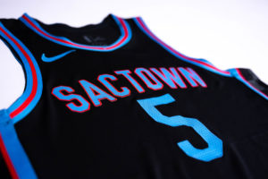
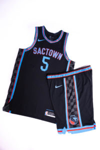
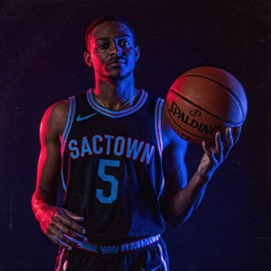
The Sacramento Kings officially unveiled their new City Edition jerseys on Monday. We had gotten leaked images of the jerseys, but now we have clear images of the final product. The team also announced that there will be a matching merchandise line of hoodies, shirts, hats, and more to match the new designs.
The release also included a statement from Kings President o Business Operations John Rinehart:
Every year, we evolve the City Edition jerseys to continue to pay homage to our proud past, honor our devoted fans and share our excitement for our proud future, said Sacramento Kings President of Business Operations John Rinehart. These uniforms weave together elements found in some of our fan’s favorite Kings uniforms to provide a sense of nostalgia with a twist.
While the original response to the jerseys was tepid, seeing a clear photo of the final product does make them look a little better. The Kings also released a video showing the how different elements of the jersey relate to jerseys of the past.
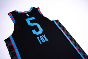
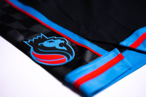
In short, the jerseys are a mishmash of 4 different designs. The bright blue is from the old baby blues, the black base color is from the Greatest Show On Court black alternates, “Sactown” and the red are from the awful red alternates, and the checkerboard on the side are from the mid-90s checkerboard alternates. All that makes sense, but it doesn’t necessarily mean it makes sense to combine all those elements.
I do think these are an improvement over the red alternates of last season, and I suspect these jersey will actually look pretty nice on the court. But the numbering looks very out of place on the jersey as the only blue unaccompanied by red accent. The Sactown font and the number font are at the same time original (in that they aren’t from any previous Kings jerseys) yet dull.
I don’t think this jersey is a homerun, but certainly an improvement over previous City Edition jerseys.
Take a look at these clear looks, courtesy of the Sacramento Kings, and let us know what you think.
Courtesy of Sacramento Kings
Courtesy of Sacramento Kings
Courtesy of Sacramento Kings
Courtesy of Sacramento Kings
Courtesy of Sacramento Kings
The new jersey designs will be available for purchase December 3rd.


“Meh, dear,” she wrote.
Perhaps uglier than Vlade Divac’s drafting performance in 2016 (or 2018).
Worth noting for the readers that Tim hates these more than any other jersey ever, which makes sense because Tim has absolutely terrible taste.
I hate the gold more.
And that’s it.
And if I had terrible taste, would I constantly wear cargo shorts and kings t-shirts everywhere I go?????
Getting lucky on one choice doesn’t make all your choices excellent.
Oh, very definitely. They’ll never make a worse jersey than the gold ones.
This Jersey really reminds me of the past. As A teenager I would eat everything in the house. Consequently the combinations would become strange as the end of the week approached. Worst combo was peanut butter and jelly on white bread, canned chili, and store bought chocolate milk! This Jersey makes me feel worse than that combo did.
I can live without them.
If we win a championship in them, they are beautiful. [Narrator; we won’t]
Otherwise, they are ugly as sin.
Imagine selecting these “blues” over royal blue. Yikes. The reds are way better.
The promotional video is horrible. They showed the jersey in shadows and low light the entire time so you can’t get a full look at it. Even that promotional shot of Fox in the blue and red light doesn’t do it any favors.
I’d be fine with this if they replaced the red with a bright purple. Not great either way, but better with purple than red.
Agreed, the purple is a must. I’d be happy if I never saw another Kings jersey with light blue on it. This isn’t Kansas City, Cincinnati or Rochester.
Four of my favorite dishes are filet mignon, lasagna, fried chicken and crab legs. My guess is that if I put them in a blender and hit frappé, I would not be thrilled with the result.
But don’t you have to try it out to know for sure?
As long as it replaced the red, I’m fine with it. But does that mean we have two black jerseys in this year’s rotation?
These are hideous! Bring back the Red ones!
.
Badge Legend