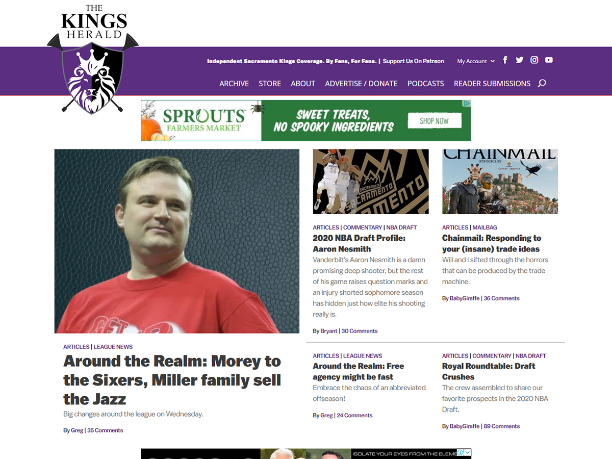
Welcome to the new version of The Kings Herald! If you look around you will notice a few new changes to the site.
Let’s discuss it.
Wait, first clear your browser cache.
Ok, now let’s discuss it.
We wanted to streamline the layout a little more for everyone, beginning with the header.
All of the header buttons are now within the top banner to give a more cohesive feel. You will also notice a new feature in the header: a search function. You can now search for players and news in our archive. You will also see a new button for Podcasts that links to a page where all of our past podcasts are housed. On mobile the menu is now a drop down.
Oh, and hey, look at that, we have a breaking news banner!
At the top of the homepage you will notice we have a highlight section for the top five stories on the site. We also now have the ability to move past stories into one of those top five slots so if a story has a lot of comments from you all we may move it back up to the top of the site.
Moving down the homepage, you will notice that the rest of the stories are formatted in a more archive layout rather than the stacked boxes in the old layout. This allows you to scroll through more reading options quickly. On the right column (on desktop and at the bottom of the mobile version) there is a sign up for our newsletter (sign up if you haven’t!) as well as our latest featured video.
And underneath this you will see a new feature we are really excited about. Our Top Comments section will allow you to see which of your comments got the most votes, which comment threads are the most active, which articles got the most comments and which users are the most active (it is based on the previous week).
Scroll down to the bottom of the page and notice the footer has been redesigned also.
We also have added two new user badges. One is for those of you who publish an article on the site (you can submit story ideas on the Reader Submissions tab.)

The other badge is a thank you to all who registered on the day we launched in April. So, if you did, you should have this badge now next to your name in the comments.
Speaking of April, we just surpassed our sixth-month anniversary last week and we couldn’t be more thankful for how this community has come together (again) and helped us build our new home. To our Patrons a huge thank you! We are able to make updates like these, and a few we made on the admin side as part of this new rollout, because of your support. And as we have said before, changes and additions will continue to happen to make sure you have a good experience on the site.
Thank you all for the support and for reading.
Oh, and we have a few other surprises in store over the next couple of weeks we are looking forward to rolling out so stay tuned!




Love it!
Well done, peeps.
Amazing work, you guys!
Looks good.
Nothing to add, just wanted to see if I get an OG badge. That would be cool.
Niiiiiiiice 🙂
Looking good around here!
Guys, well done. This is a far more usable layout. I work on a web dev team and have been around usability discussions, so have some feel for it. Good work.
John
Looks great.
Big improvement looks wise on my phone.
Nice touch. Any sign of an iPhone app yet?
Not greedy, just curious…
When I click on the “my comments” drop down on the non-mobile site I get redirected to the front page. Is it just me?
Otherwise, I’m digging the new TKH look. Well done!
I get the same thing, but maybe that’s because I don’t comment very often. None in the last few weeks before today.
This is fixed, thanks for letting us know! Clear your browsing cache and try again.
And they avoided the Man!

Great work!
Blake has been crushing it on this site from the jump. We’re so lucky to have him.
Not resting on your laurels, working to improve your product?
You should get a premature extension, guys. Well done.
A little help? When you read through all the comments of an article and you’re scrolled all the way down, how do you get back to the front page? Do you just use the back button? Could we make the logo in the new footer a link back to the front page?
Logo in the footer now takes you back to the homepage!
This better than a filterless Camel.
I don’t like it.
Thank you all for improving upon your great work!
AP photo – pictured: Blake Ellington of The Kings Herald

Some of us are OG .. so this new stuff .. yip
 ?w=1200
I thought you were an OG, too? Shouldn’t you have a badge, ZillersCat?
Looks good. My only suggestion as a personal preference of mine is to see a date/time for each story on the front page. It has it once you click through to each story, but seeing it on the front page makes it easy to see what is new/timely, especially if I haven’t been to the site in a day or two and may have forgotten which articles I had already read.
Want to see if I have the OG badge. And the verdict is….*drum roll*…
Yeaaaaaah!!!! Woo hoo!
Looks great, thanks for keeping the fan blog alive and continuing to make it better than ever!
TKH is the most impressive part of 2020, although the bar IS pretty low. ð¤ª
banned
Flagged. Am I doing this right?
I love how this looks, and it is much easier to navigate. Excellent work everyone.
Alright alright alright.
Great update! Really, really appreciate the work.
My only suggestion/critique (as someone using the desktop website) is that there is a lot of empty white space above the banner. I would move the “The Kings Herald” lettering into the purple banner and move the banner up to the top of the screen. This would economize on vertical space and feature more of the content below.
Could we have the ability to create fanposts/fanshots?
Dark mode next! Dew it!
You guys are doing an excellent job. Building sites aren’t easy, but you’re pulling it off nicely.
Nice
Site readers (any site, any time there’s a redesign): ARGHGHGH I HATE THE NEW LAYOUT
Next time there’s a site redesign: ARGHGHGH THE OLD DESIGN WAS SO MUCH BETTER
Good work, folks!
Badge Legend