

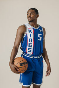
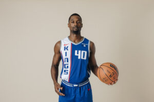
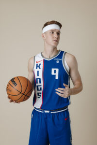
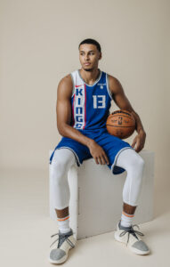
The Sacramento Kings have officially unveiled their 2023-24 City Edition Jerseys, confirming leaks from earlier this summer. The new design is royal blue, with a vertical Kings in a white stripe.
From the Kings:
“This season signifies the 100-year anniversary of our franchise and the team’s new Nike NBA City Edition Uniform was designed to celebrate this momentous occasion,” said Sacramento Kings President of Business Operations John Rinehart. “The uniform has reimagined one of the most iconic jerseys in NBA history, the 1968 Cincinnati Royals road uniform, and we are excited to share it with our fans.”
The updated design blends the historic Royals and Kings colors, prominently featuring royal blue, the team’s primary color for seven decades, mixed with the organization’s newly updated gray. The jersey’s anthem tag pays tribute to the franchises heritage by displaying various crown logos, a cherished secondary symbol that has been an integral part of the team’s identity since the days of Rochester. Additionally, the shorts showcase the modern ball lion logo in legacy colors.
The uniform will debut on November 10 during the team’s first NBA In-Season Tournament game and the court will debut on November 29 as the team takes on the Los Angeles Clippers at home.

Overall, these are a solid design. I’ve given up being overly mad about City Edition jerseys since we’re constantly being inundated with them and even the good ones are gone in a year. These are far from the worst City Jerseys we’ve seen over the years. My main complaint is that the K in Kings is too close to the swoosh, but that’s a minor nitpick.
The new jerseys will be available to purchase in the Kings team store and online starting November 2nd, according to the Kings.


I see your complaint Greg, they had some room for sure. Could’ve moved Kings down an inch…overall, pretty decent though. I’ll take them over the red, or baby blue, haha.
Don’t like these either, their boring and have no connection to the city. I like the colors, but it takes way more than that to make an interesting kit.
What would make it more “Sacramento”?
Pollen. If it had pollen all over it!
That’s my larger overall issue with these “city edition” jerseys. I know these jerseys are really just a cash-grab by producing another potential jersey to sell, but they could at least find a way to make is more related to the city or team history. The designers are supposed professionals working for one of the largest companies in the world working for one of the most powerful sports league in the world, I expect more of them.
So how would they make it more “Sacramento”?
If a fan can’t think of something (pollen aside) then what are some designers who don’t love there suppose to do?
The tower bridge, showing the Sierra Nevada’s as a faded background image, or designs incorporating a river, river delta, or riverboat theme, gold-rush history, an image of the capital building…just a few thoughts from someone who has no idea what they’re doing.
IMO, 8/10 of these city edition jerseys are “meh” (or outright trash), a few them are dope though so I keep hoping for a good one for Sacramento.
Late to the party as always but…
Paying homage to the team’s roots by reflecting on their 100 year history (a literal bench mark no other franchise has reached yet) isn’t enough of a creative stab for ya from the team’s marketing department?
Were you expecting the logo to incorporate the Tower Bridge or some government buildings with some hipsters in the background?
I feel like they’re pretty good throwbacks to the aesthetic of those 100 year old teams. Interested to see how the modern gray pairs with the throwback blue in real life. I’m still partial to the Statement jerseys at the moment, just for the checkered throwback on the side piping. Not sure I’m going to love the material, tho.
Anyway, how serious are we taking these alternate jersey builds? Honestly, what “more” are you needing from your 4th jersey variation of the season…?
Grifting politicians and homeless tents? A farm and a fork?
Why is the Nike logo above Kings would be nicer to have the crown. I like the jersey but not the whole fit.
Those are awful looking IMO.
I’ll go against the grain here, I thought they looked good in person. They showed the jersey at Fan Fest Saturday and had them for sale in the Kings Store.
Off topic but Sasha got booed for refusing to dance with the rookies. While I’m giving him a bit of a pass because he’s not really a rookie in the sense that he’s been playing basketball at a high level and he comes from a different culture than we have in the US, he should have done something other than site on the sideline and get booed.
I usually have a little nit to pick about every city jersey, and then I end up liking them.
I already like these. 🙂
I just checked out the Kings team store online and they already have some cool new stuff up. Some more neutral stuff–not so purpley like usual. Cool stuff!
This season signifies the 100-year anniversary of our franchise……..Where did this come from????? Team began in 1945/46.
Wikipedia has a pretty good write up of it. Began as Rochester Seagram’s (sic) in 1923. Oldest franchise in the NBA. That I did not know.
I just went and read about the Seagram’s, never even knew they existed prior to the Pros/Royals/Kings.
Badge Legend