
The Sacramento Kings haven’t updated their primary home and road jerseys since 2017, but that seems like it’s about to change. The Kings primary white (Association) and purple (Icon) jerseys are stale, and the Kings mostly avoided them in the playoffs in favor of the black chainmail (Statement) and grey (City) jerseys. A jersey refresh has been rumored for a while, and on Tuesday the Sacramento Kings sent out a teaser that seems to confirm the rumors:
https://twitter.com/SacramentoKings/status/1658487477802504194?s=20
I’ve personally never been the biggest fan of the cursive logo, but the teaser version of the new cursive design seems to have tweaked the design of the “K”, and I like it:
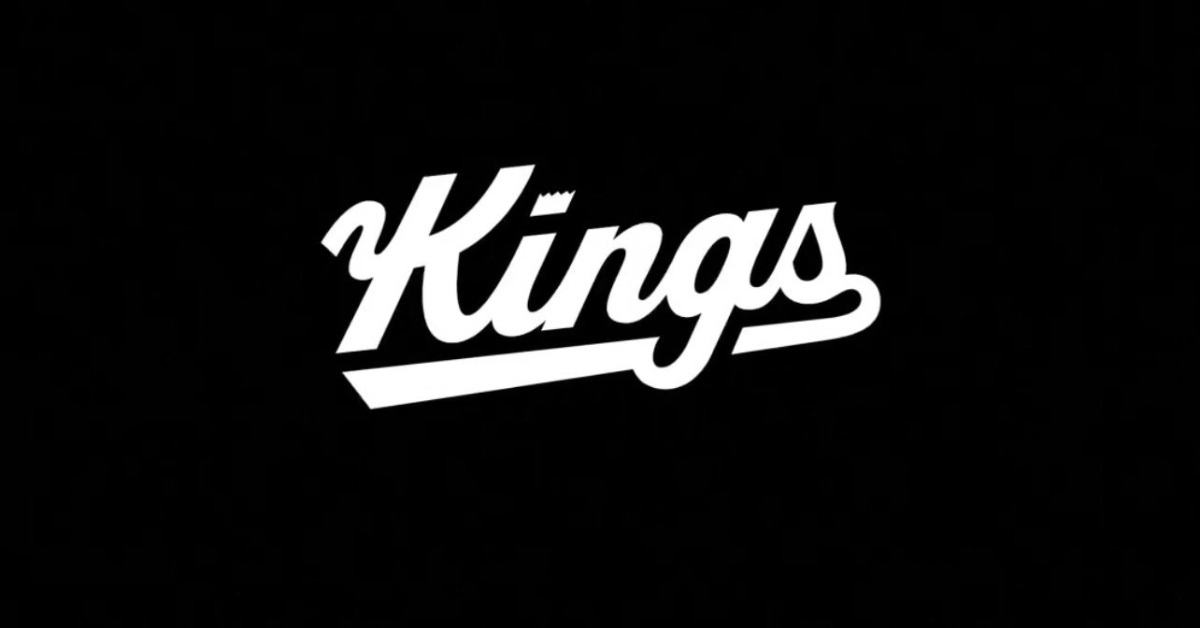
We don’t know if there will be any additional changes, but I assume the Kings will retain their primary team logo, as well as the alternate logos like the lion head and the dribbling lion. I’m guessing this is just a refresh on the jersey designs themselves, but at this point we’re just speculating.
It’s unclear when we might get to actually see the new designs, but I’m excited to see what the Kings come up with.


Me Likey!
The “K” looks like the Cyrillic (Russian) letter, zhe.
Leave well enough alone.
As long as there’s no baby blue or gold lamè, I’m agnostic.
I’m glad they are moving away from the “K” looking like an “H.” Once you see “Hings” from previous years, you can’t unsee it.
Case in point:
LIGHT THE HEAM
Me No Lihey!
Yep. It’s now burned into my brain. Thanks for nothing!!
It looks like Himgs.
Go Himgs!
It’s Thmgs, actually.
Like Woody Allen’s 1969 Take the Money and Run: “This is a stick up. I have a gub.”
Can we take a moment to appreciate that it is Lottery Day and instead of agonizing over lottery balls we’re looking at new and revamped branding?
Such a weird feeling of not being glued to wathcing the Draft Lottery results, praying that we jump into the top spots after 16 straight years.
It’s actually crazy to think that since 2017, the Kings leapfrogged three times; 3rd in 2017, (that got pick swapped to 5th, but at least it turned out to be Fox), 2nd in 2018 (we don’t talk about who we did/did not select in this one), and 4th in 2022 (Keeeeeeeeegan Murraaaaaaaaay). And all three of those times we the 7th-8th best odds.
TBH, I missed the feeling this time of the year. Must be the result of 16 straight seasons in the lottery lol. Was amazed how I just started watching draft prospects in YT when we’re in the middle of May as opposed to watching prospects in early December or January.
Now I understand why fans from opposing perennial playoff teams says that they don’t care or watch the draft lottery or don’t know the name of some of the top prospects.
I didn’t even know when the draft lottery was until yesterday. In previous years it was highlighted on my calendar
How things have changed. If we’re going to the west finals next season, I might totally forget that the draft lottery exist!
The most important day of the season
After another disappointing 82, and the season ending in Mid-April it was the long awaited dessert for the year past and the appetizer for Summer League and the next season (especially since FA signings were expected to be disappointing).
Thank You Exec of the Year Monte McNair (and Wes Wilcox) and Thank You Coach of the Year Mike Brown (and Jordi Fernandez, Jay Triano, Luke Loucks, Leandro Barbossa, Doug Christie, Lindsey Harding, Dutch Gaitley and Deividas Dulkys
Finally this year, it’s different – it’s better!
Light The Beam!
Always more concerned about what’s in the jersey than what’s on the jersey. But if the proceeds help keep the beam lit, why not?
“Sign me to a contract!”
Especially when described by Ailene Voisin.
(failed link to Oliver Miller wearing Kings #8)
Was really hoping for the return of the 01-02 black jerseys, but excited nonetheless. Also agree that the new K is much better than the cursive one of years past. It seems like they fashioned the K around our dribbling lion logo. Looks sweet.
I was hoping they would have worn the early 2000 jerseys for one of the home playoff games, would have been a nic homage to that era.
Honestly thought they would whip those out for Game 7. Glad they didn’t considering the outcome, but definitely need to see those some time in the near future.
-Get rid of those ugly gray jerseys.
-Bring back the 90s blue and red jerseys as an alternate.
-Bring back the early 2000s jerseys as an alternate.
-Never bring back the gold jerseys.
I love the grey jerseys ????♂️
I like them a lot as well. At my age I think I’d look silly in a jersey but if I were to buy one, that would be it.
I think I’d like them if the grey was darker. To me the current grey color is off putting for some reason.
Agreed. It also looked wrong when the Kings played a team wearing white jerseys. They looked a bit too similar and just left a colorless look to the game.
I must be in the minority but I love the greys, even bought one.
Agree with all your other points, the golds must be locked away forever.
I agree with you about the greys, they’re boring, for lack of a better word. As an accent, maybe, but not as the main color.
Also not a fan of the grey jerseys at all.
(cue nostalgic 80’s song)
I was surprised by how much I enjoyed this movie.
I thought it was a lot of fun. Great cast, a lot of fun nostalgia, and Affleck’s movies always have great pace.
Don’t love the new cursive Kings logo. Looks like a lion’s tail added onto the K.
I wonder if that’s what they were going for, would be hilarious if true
Bring back that real royal purple too.
I like the current jerseys–leave them alone, focus on what’s important: winning!
It’s funny that all I noticed was the change to the “g.” This is why I love this site/community!
Badge Legend