

The Sacramento Kings unveiled new jerseys for the 2023-24 season, and the refresh looks fantastic. These are what the league refers to as the Icon and the Association jerseys, which are just confusing names for the team’s two primary jerseys:
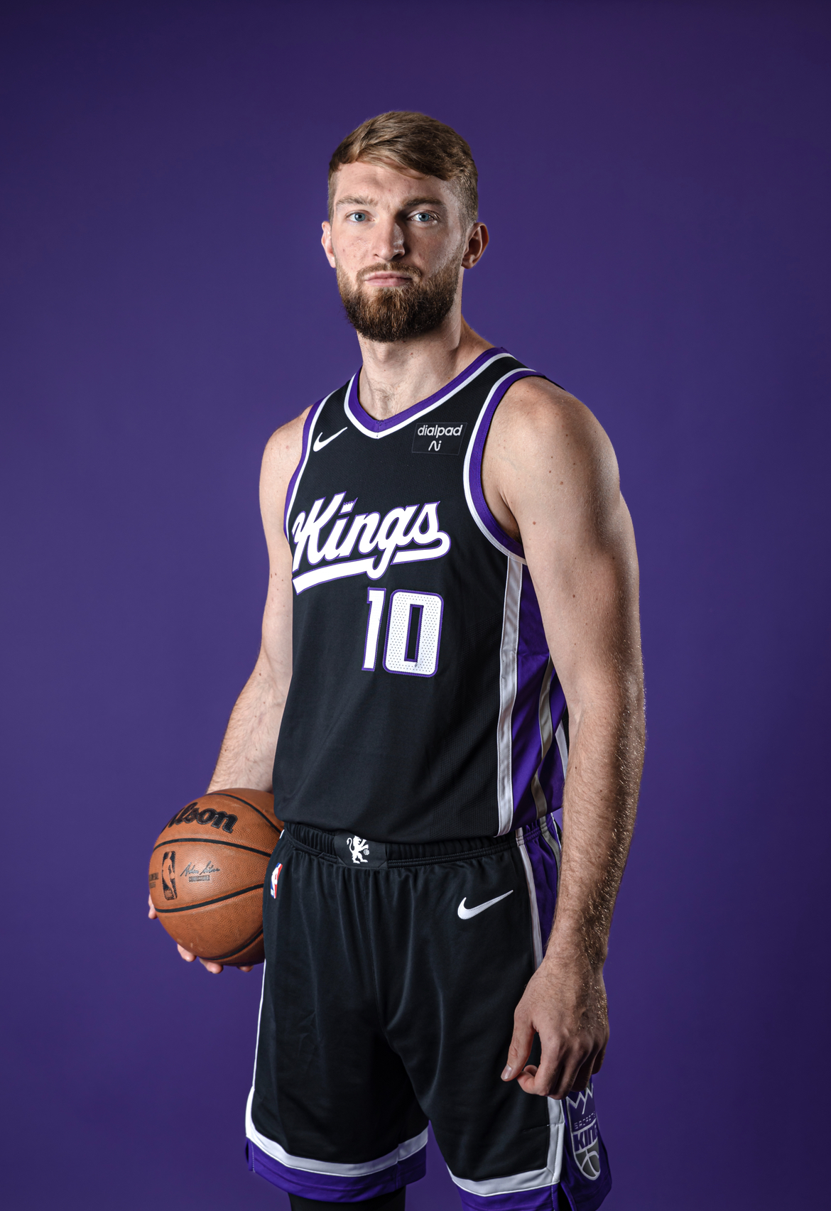
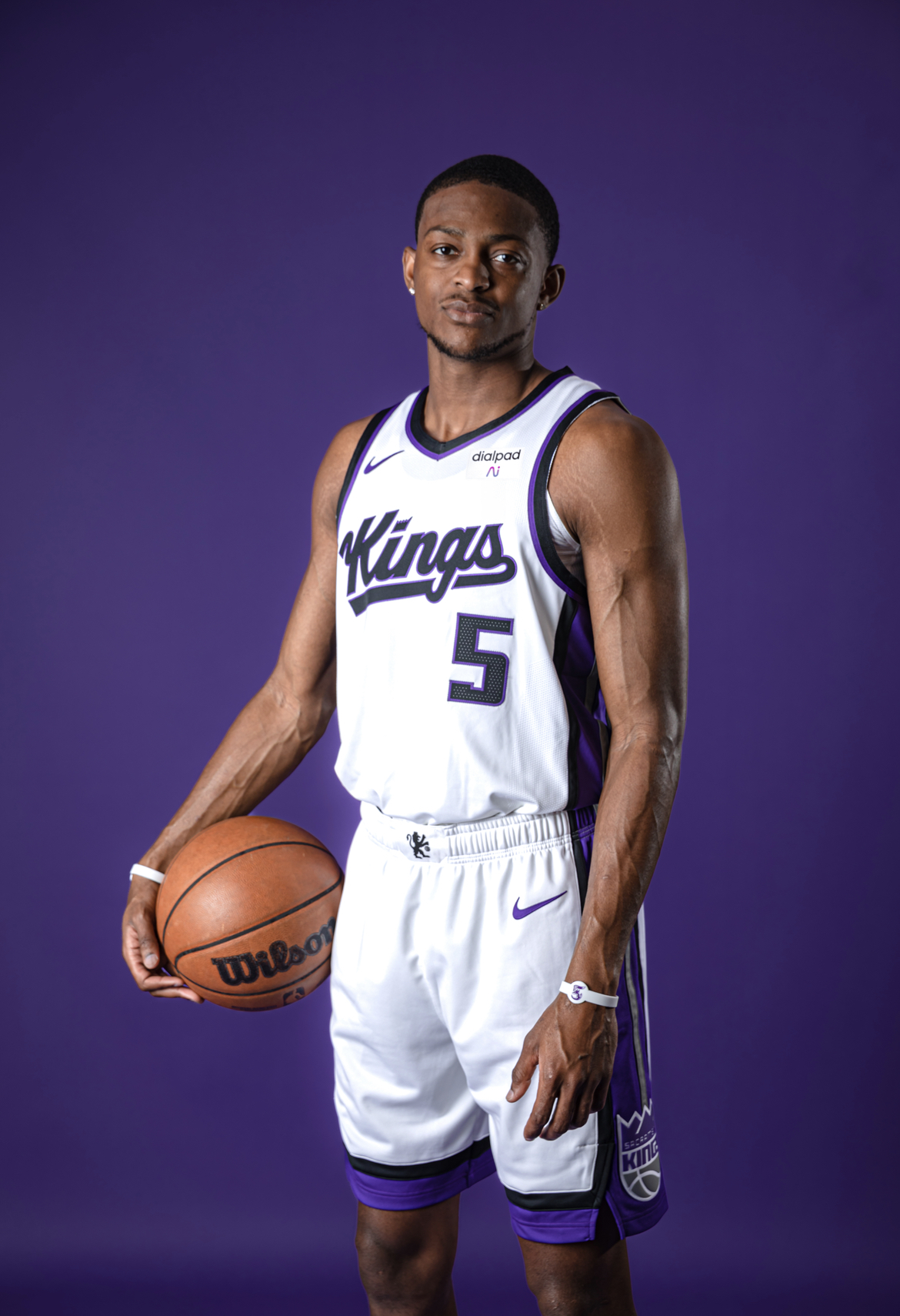
The new designs are simple, and don’t take any big risks, but they are a clean design that is definitely an improvement.
The Kings will also be unveiling a new Statement jersey on July 5th. The previous Statement jersey was the black chainmail design. The Kings will also have a City jersey revealed at some point, and the Kings will have an Earned jersey design, which is an extra design only for teams that made the playoffs the previous year.
No word yet on when the new designs will be available for purchase. The Kings did say that the jerseys will not be available to buy at the California Classic, but that related merchandise will be available.

Update:
I’ve been informed that the league is no longer doing the Earned jerseys. Clearly the league decided to discontinue the practice rather than give Sacramento their due because the entire league is against the Kings. Alas. I guess we’ll have to settle for four new jerseys this year instead of five.


These are pretty sweet, but I can’t wait to see what nonsensical garbage Nike sticks us with.
As ever, as strong NO vote on any baby blue shit.
See, they made changes to the team after all.
The video that accompanied the announcement was pretty good too.
The gold on the shoes scares me.
Flashback nightmares!
I’m still not 100% sold on the “K” in the logo, but at least it isn’t an “H” anymore. I can never unsee the “Hings”
Thanks for posting that. Was looking to see how it was different. I’m not a fan of the tail on the “K”. Would be a lot better without it.
Fox has been putting time in the weight room. Not a skinny kid anymore.
The tail on the K is ugly as hell…makes it look like “ylings”
This is coming from someone with a last name that starts with “K”…I spent many days in a classroom ignoring my teachers while trying to come up with the coolest way to write my name in a notebook, not a one had a tail on the K.
They should just spell it “LINGS”, so I don’t have to correct my autocorrecting phone
I’d be lion if I knew why they put a tail on the K in
KongsKings (oops! autocorrect),And I bet Jalen
SlamsonSlawson (dang! autocorrected again!) is OK with the K.As for me- I like the new jersey logo. They elongated and angled the arm and leg of K to clearly read as “K”.
Very cute video! Feed that beam!
Already commented weeks ago this looks like the Cyrillic letter ‘zhe’, Ж ж, not a “K.”
I like the new look a lot. Icon and Association? You mean home and away? Almost like we always had this version. No write up on the California Classic? I’m taking my two kids with me today. Would’ve been nice to see Wemby play, maybe he will be there cheering them on. Not at all sure why the Kings put Keegan on the Summer League roster. You’d think a full time starter and All-Rookie team guy wouldn’t need to show out.
Seems like it might be useful to the other players to spend time playing with a legit NBA player. Besides, Murray is pretty far from a finished product, and he may be able to try out some new facets he’s added to his game. Things like improved rebounding, attacking the rim, and smiling.
https://www.nbcsportsbayarea.com/nba/sacramento-kings/why-keegan-murray-playing-summer-league/1637696/
What’s wrong with purple?
if they’ll lose in them they’ll be ugly, if they win in them they are great.
I like the whites, but the black unis are kinda meh..
I’m with you. The purple trim along the neck line of the black jerseys is kind of wonky. The black trim with a hint of purple on the white jerseys, however, looks great.
I think what does it, is the black trim on the white jersey matches the font and number, but the purple trim in the same location on the black jersey does not match the font and number. The continuity is off.
I love em’ They even have Slamson’s tail on the left of the K. Represent!
It was the tail on the “S” in Sacramento that made me go with the alternate / city(?) gray jersey last year (which I love,) and its the tail on the “K” that’ll probably have me liking the alternates this year.
The numerals are ok but I’m not in love with the texturing. Kind of like the tail, it’s extra but you can’t quite figure out why because the only thing it contributes is in being a distraction from the overall pleasant vibe of the whole.
Edit: forgot to mention I really like the shorts, though. Not sure they’re a huge difference from last year’s but I def like the mini logo on the front, the piping, the side splits down at the hem, all of it. Well done there.
These jerseys are like Monte’s offseason work: not a big change, just slight changes.
And some people will hate ’em and some will love ’em.
Me?
Ow.
Did you notice that Sabonis’ shorts were longer- I think they reflect his extension.
Maybe not.
I liked last season’s light grey jerseys. Also, they lavendered down the royal purple on those jerseys – a pastelization as it were.
I like that newer, softer colored look and that it belongs to this new look Kings team. I’d like to leave the 2000 Kings look back with that group and move past that Glory time and celebrate today’s squad as the unique group they are.
Bummed about not getting the “Earned” edition jerseys. But hopefully we’ll be getting the “Christmas” jersey treatment this year! Wouldn’t mind watching a round 1 playoff rematch on Christmas Day. Also keeps both teams close to home no matter where it’s located (hopefully in Sac). Light the Beam for Santa!
At first I was like, pretty nice (way better than hideous purple ones), but the more I see them the more I like them. No more looking like a WNBA team, these jerseys and this team now demand you put some respect on our city!
Design is ok. I do like black but ffs they need a lot more purple. Not a fan. And white is just an awful color
These look like old jerseys–nothing new or exciting. This past season’s (winning) uniforms looked excellent should have been kept.
Badge Legend